
THE PROJECT:
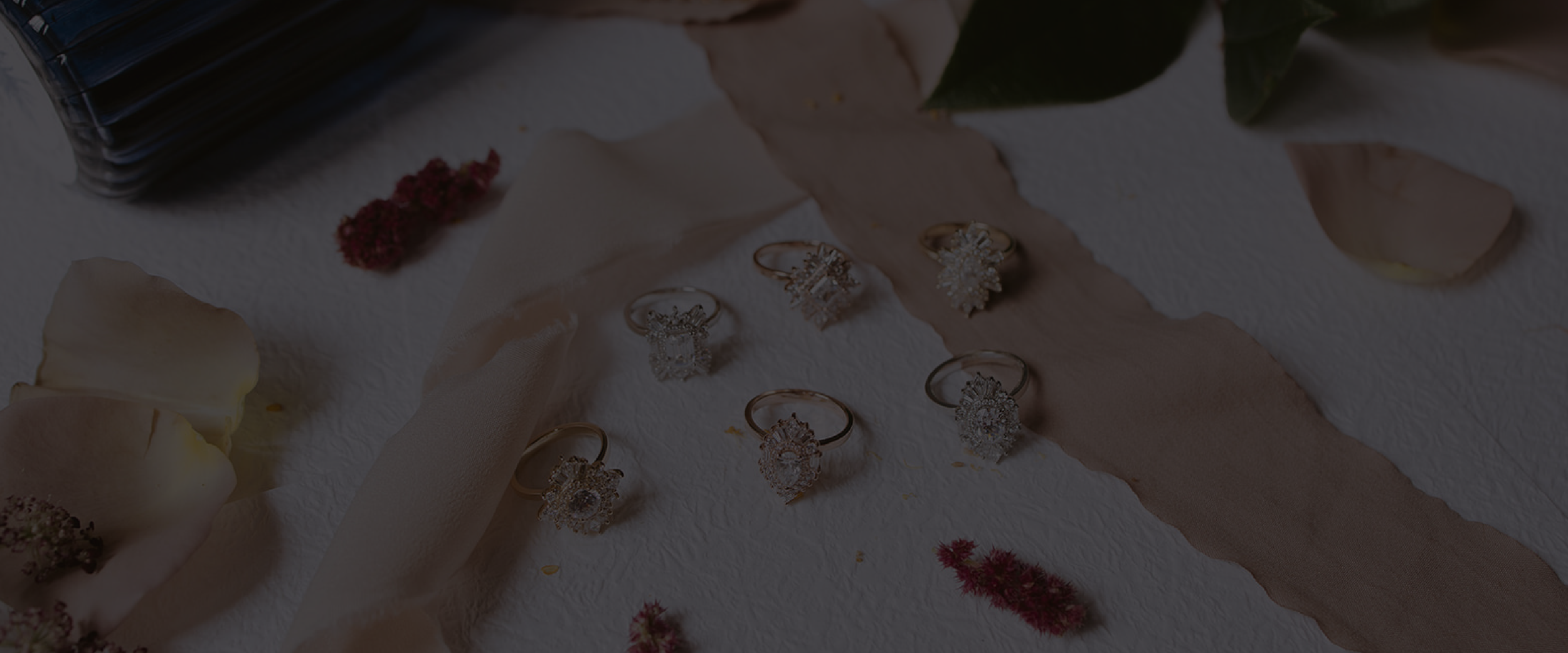
For Katie Brooke Designs, a bespoke jewelry brand specializing in custom-made engagement and anniversary rings, the brand identity was developed to reflect Katie’s passion for timeless, unique designs. Her approach to creating rings—blending vintage-inspired elements with modern, geometric balance, served as the foundation for the overall brand aesthetic.
SERVICES:
Logo Design
Brand Identity
Packaging Design
Marketing Materials
Website Design
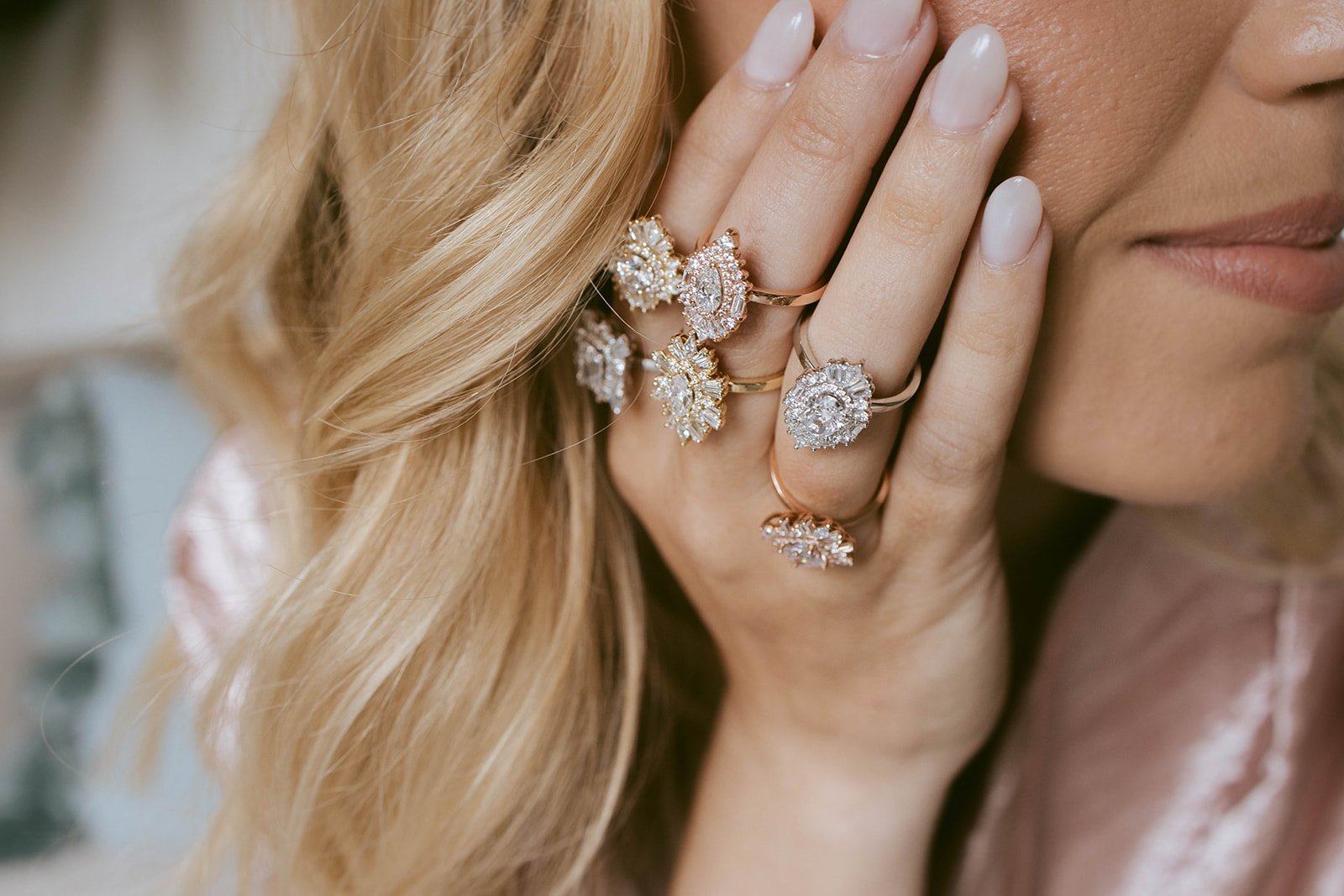
The project included logo design, brand identity development, packaging, and website design, all aimed at resonating with clients seeking personalized, one-of-a-kind pieces that tell their love story. The final design mirrors the elegance and precision of Katie’s craftsmanship, emphasizing both individuality and timeless beauty. The result is a cohesive brand presence that highlights her dedication to detail, her love for vintage elements, and her commitment to crafting rings as unique as the couples she designs for.

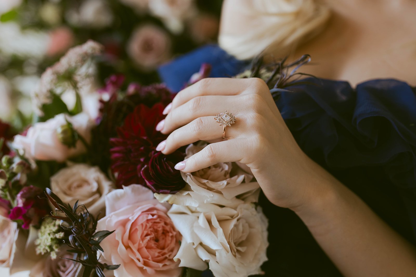
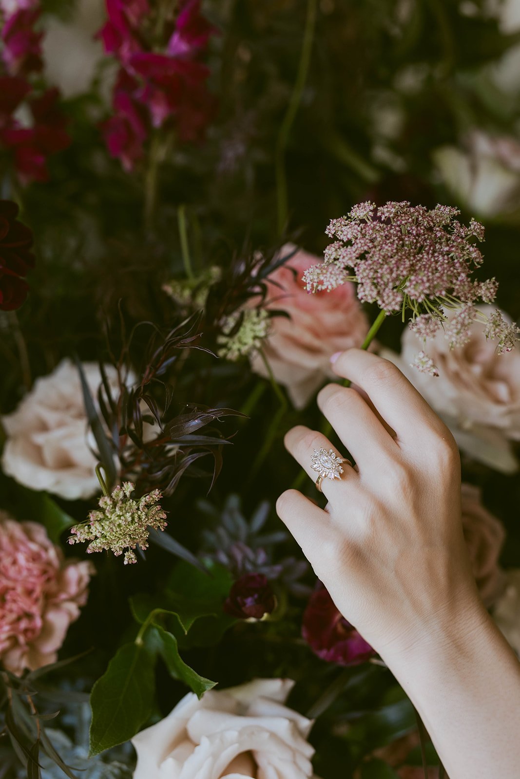
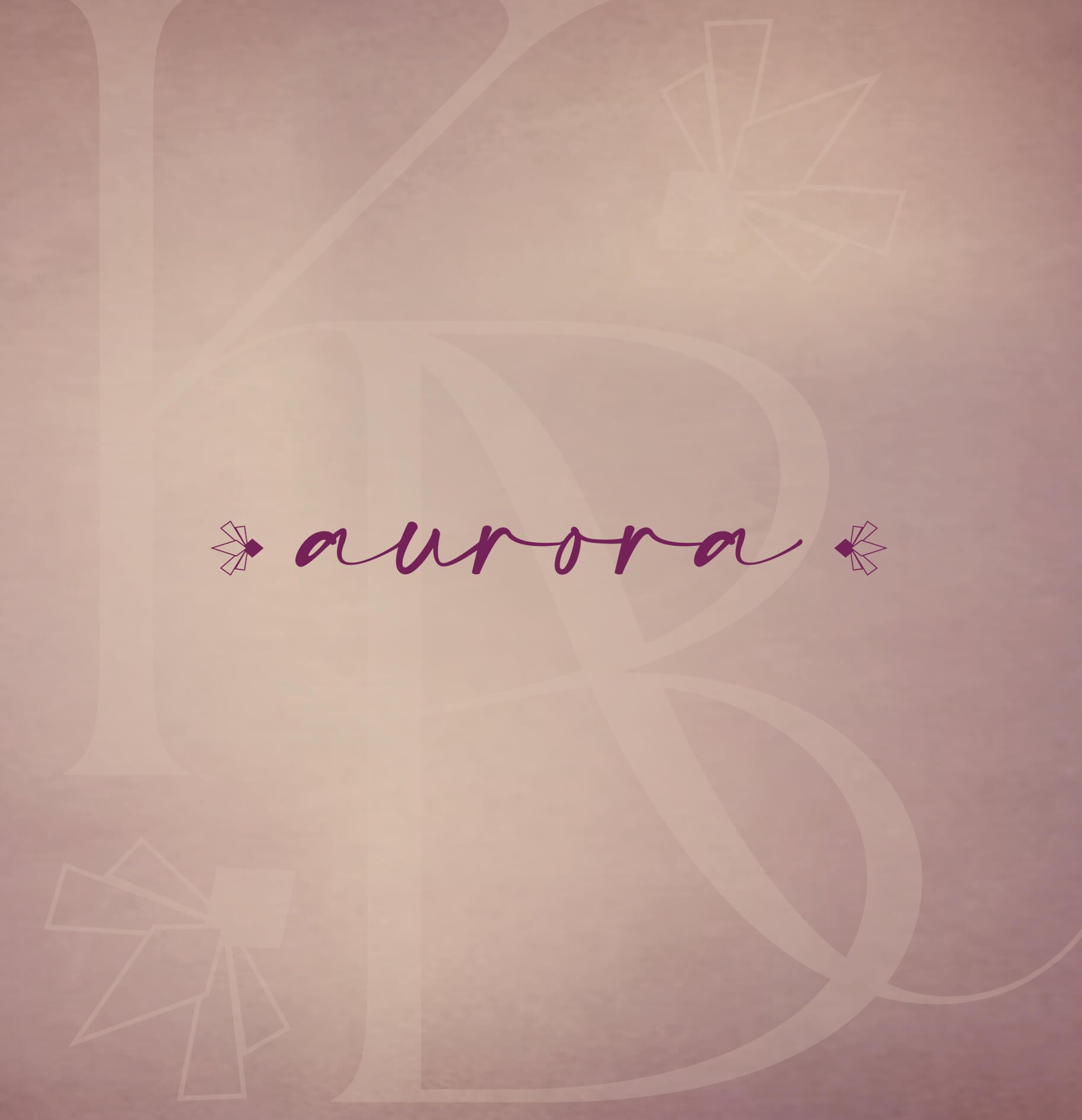
The submark of the logo draws inspiration from the refined elegance of the Aurora Ring, incorporating elements such as kite-cut stones and tapered baguettes. These details are reflected in the submark’s delicate, symmetrical design, symbolizing the brand's balance of timeless sophistication and modern craftsmanship. This mark captures the essence of Katie Brooke Designs’ commitment to creating bespoke, handcrafted jewelry with a unique, enduring beauty.


KIND WORDS
”Thank you for playing a huge role in making my dream come true!!! I cannot thank you enough for all of your help and patience. It has been such a pleasure working with you!”
— Katie, Founder of Katie Brooke Designs

Previous Project:
< THE WEEKEND COFFEE
Next Project:
COCOSOAK >
First impressions matter.
The right identity builds trust before you say a word.
Let’s work together to design the brand your business deserves.