THE PROJECT:
Our approach was centered around capturing the emotional experience of the weekend: bold, laid-back, and full of potential. From the bold color palette + checkerboard patterns to the confident typography and tagline development, every detail was built to resonate with a coffee lovers looking for a little escape. The strategy emphasized adaptability for merchandise, packaging, and promotions— giving the brand room to grow while staying rooted in its identity.
SERVICES:
Logo Design
Brand Identity
Packaging Design
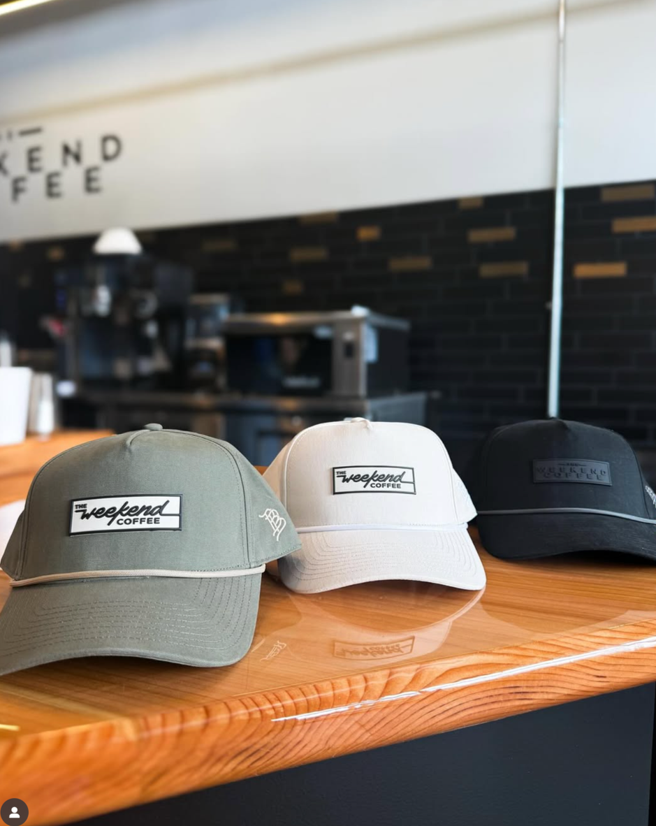
Merchandise
Marketing Materials
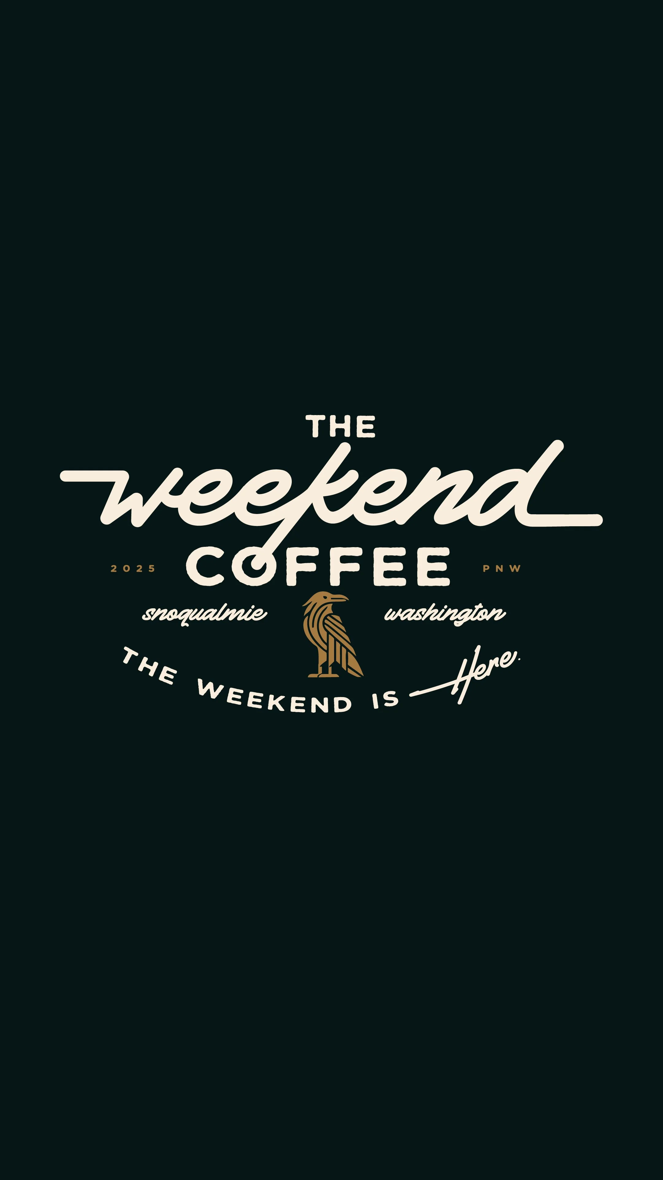
Designed to feel like the weekend— every day of the week
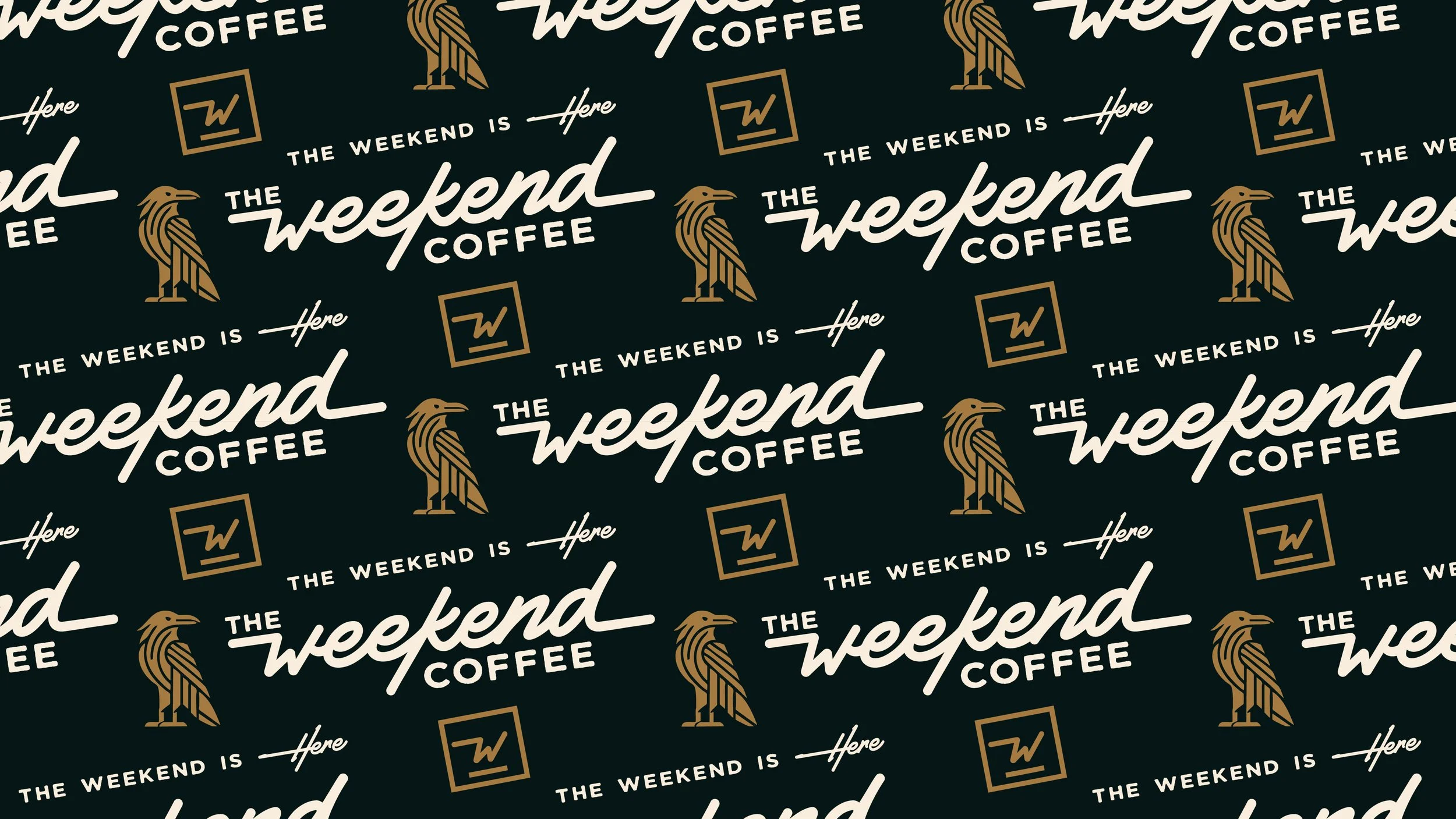
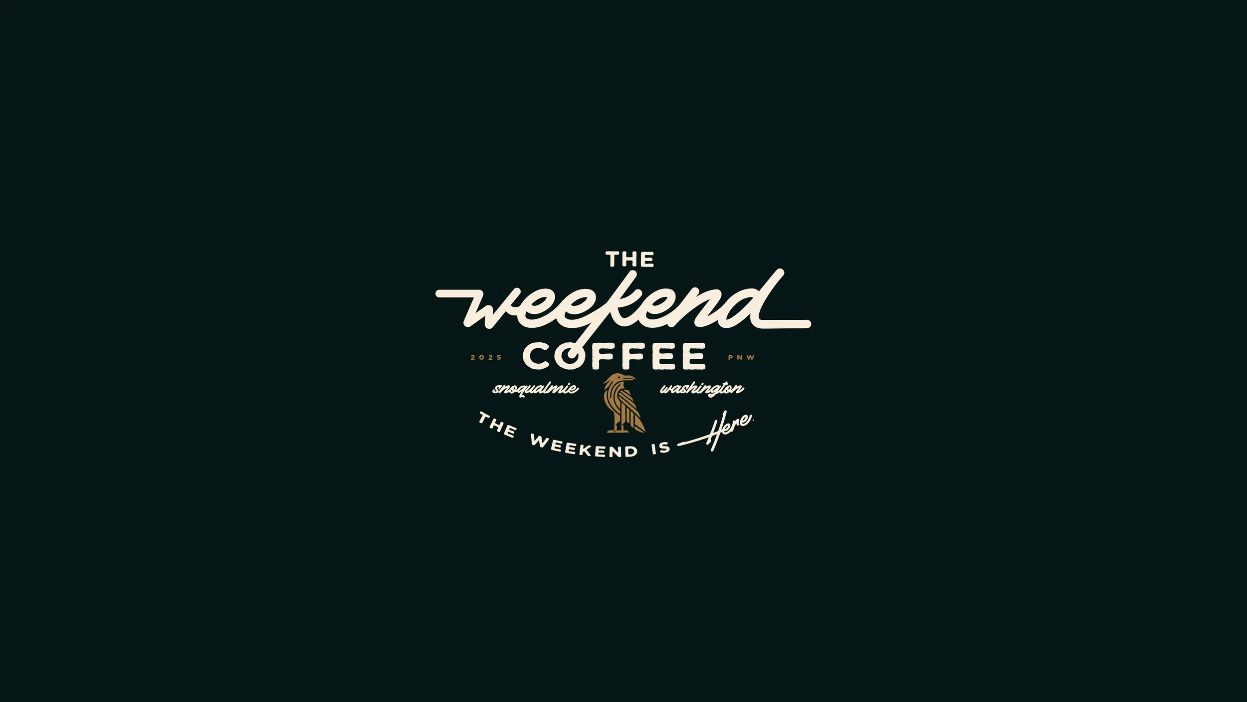
The logo system for The Weekend Coffee is grounded in strong typographic contrast. The custom submark designs add flexibility while reinforcing the brand’s bold, story-driven identity. These elements work seamlessly across print, signage, social, & packaging, ensuring the brand shows up consistently and memorably, wherever it lands.
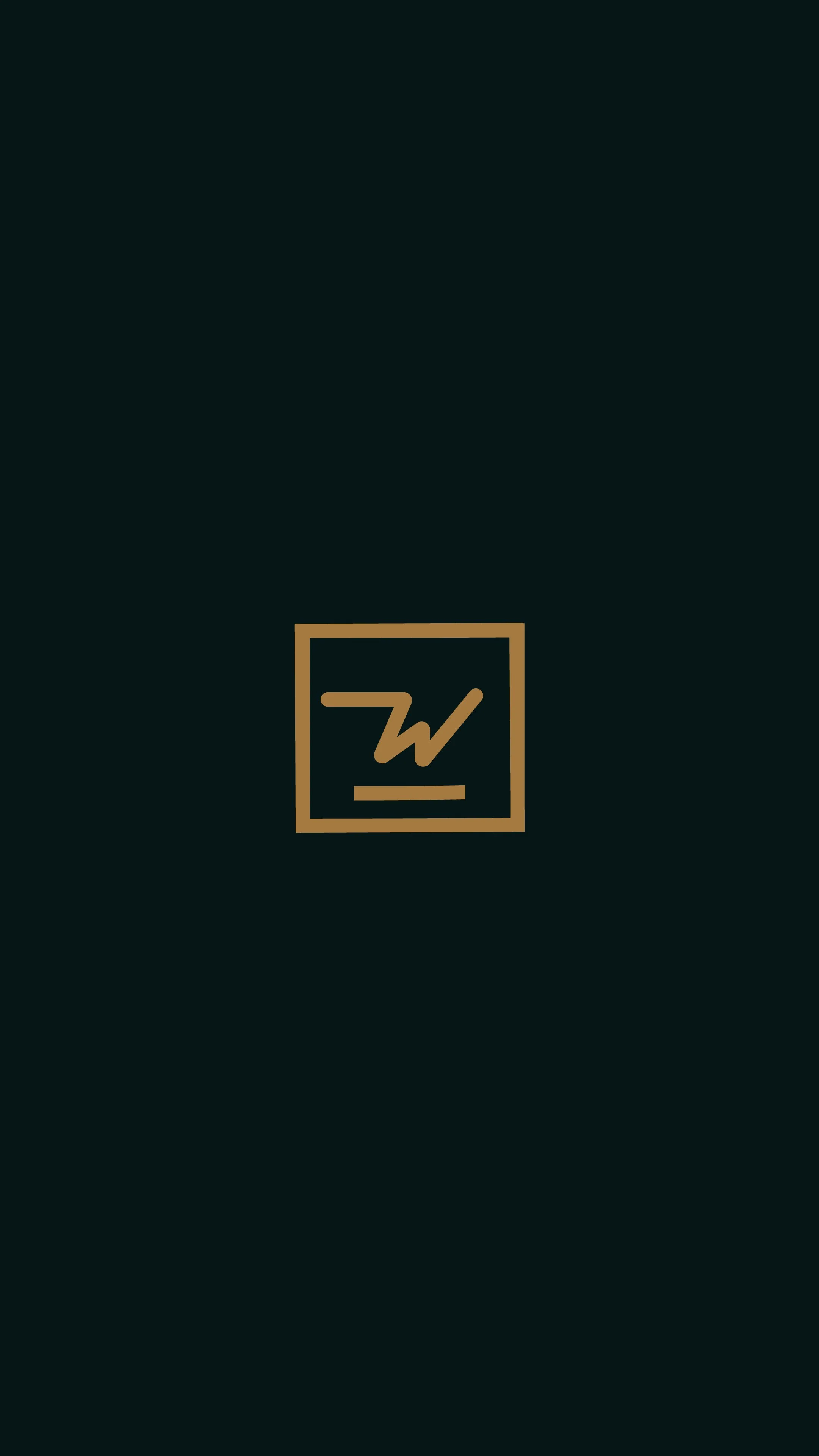
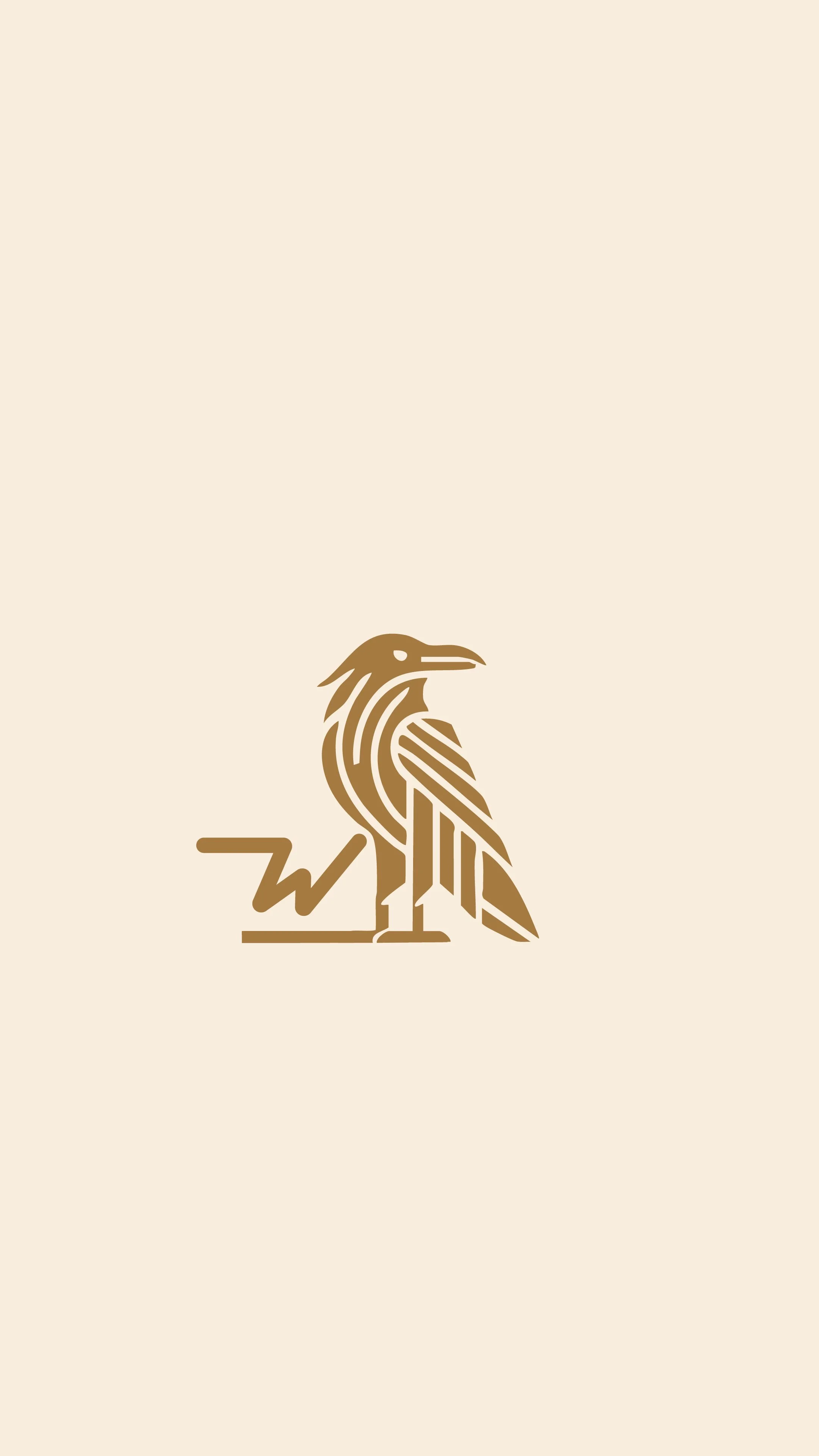
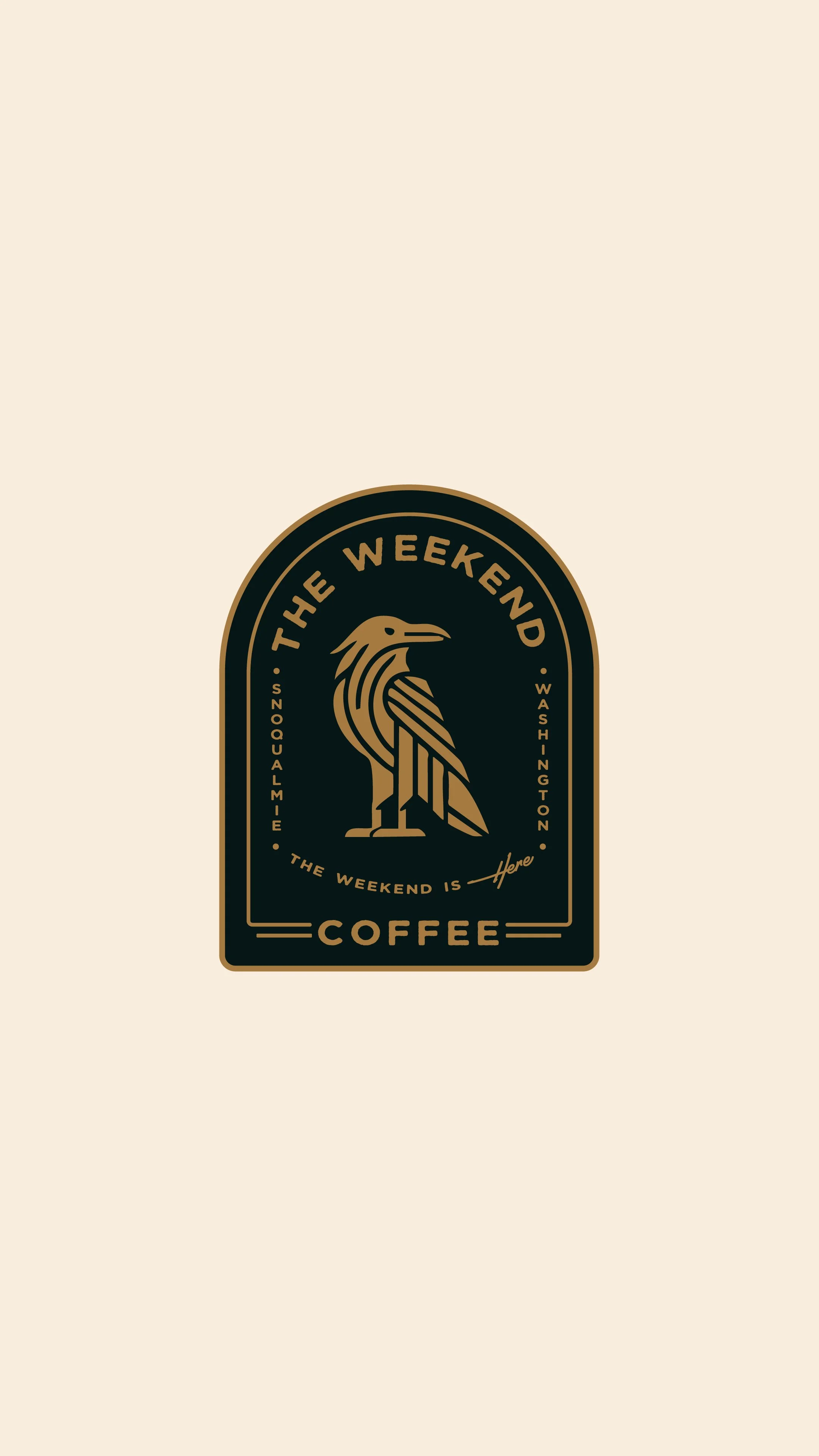

The submark design needed to encapsulate The Weekend Coffee's brand essence in a minimal, recognizable form— one that could scale seamlessly across every touchpoint. It had to be instantly identifiable on coffee cups, packaging, merchandise, and social media, while complementing the primary logotype without competing for attention. With just a few intentional strokes, the mark was designed to capture the brand’s edgy yet expressive personality. Confident, distinctive, & built for flexibility, the submark serves as a bold shorthand for the full identity.
Previous Project:
< JOSIE’S PUB
Next Project:
KATIE BROOKE DESIGNS >
First impressions matter.
The right identity builds trust before you say a word.
Let’s work together to design the brand your business deserves.